I Made 12 AI Product Promotion Posters. The Best Ones Were Not the Loudest.
A practical AI workflow for product promotion posters: launch visuals, benefit posters, social ads, and campaign graphics that keep the product clear and the message readable.

Emily Rodriguez
·5 min read

I used to judge product promotion posters with one question:
Can it look more dramatic?
That question is dangerous.
AI is very good at drama: big light, shiny surfaces, giant type, cinematic backgrounds, instant ad energy.
But when you put the poster in a real feed, the problems show up fast.
The product is not clear. The headline is too small. The benefit is vague. The image looks good on a desktop and messy on a phone.
So I made 12 product promotion posters and judged them with a better question:
Can a shopper understand the product and the reason to click in two seconds?
Start by Choosing the Poster Job
A product promotion poster is not one thing.
It can be:
- Launch poster: make the product feel new.
- Benefit poster: explain one reason to buy.
- Social ad: stop the scroll fast.
- Campaign poster: support a launch, sale, livestream, or seasonal push.
Each one needs a different prompt.
Generate a product promotion poster
Upload a product reference and start with a 3:4 vertical promotion poster.
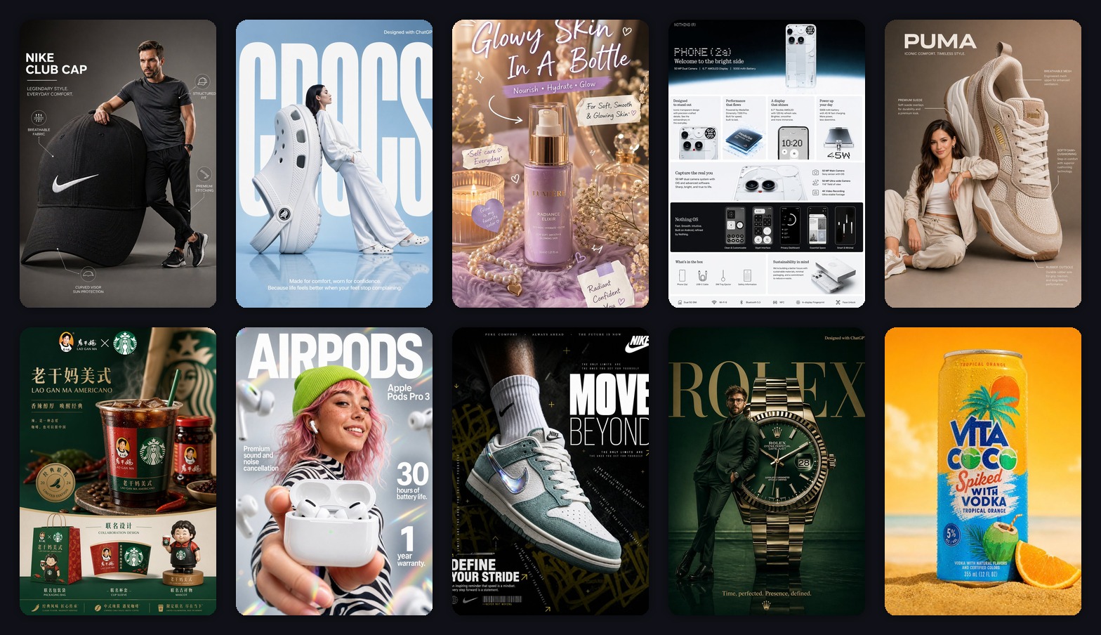
1. Launch Posters Need the Product to Own the Frame
Launch posters fail when the background becomes more interesting than the product.
This sneaker poster works because the product is big, sharp, and central.
Use this:
Create a vertical 3:4 new product launch poster.
Use the uploaded product as the hero object.
Make the product large, sharp, and premium.
Add a clean studio background, soft shadow, one short headline, and 3 small feature labels.
Leave enough empty space for final title text.
The empty space matters.
It gives you room to add final copy later without crushing the product.
2. Benefit Posters Should Say One Thing
Many promotion posters fail because they try to say everything.
Lightweight. Comfortable. Durable. New. Limited. Discounted. Premium. Trending.
That is not a poster. That is noise.
One poster should sell one benefit.
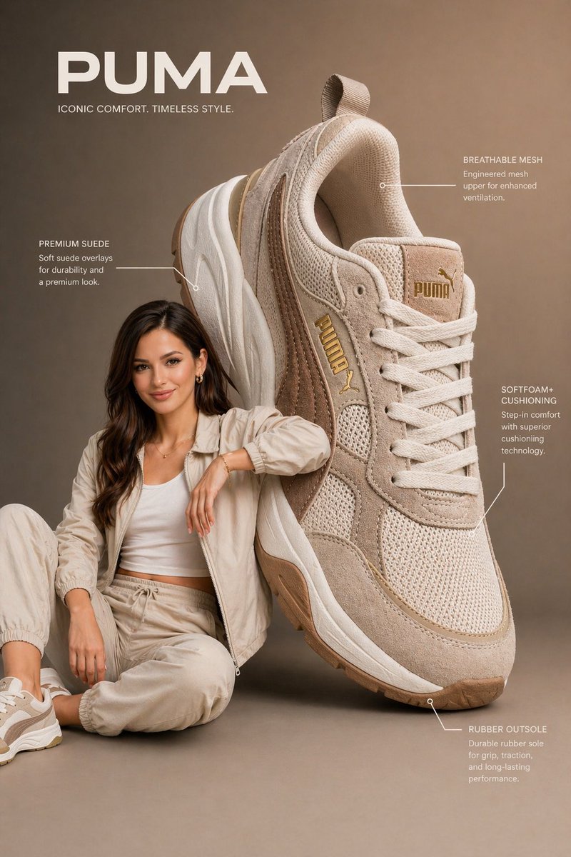
For a drink, it might be summer refreshment.
Prompt:
Create a vertical 3:4 product promotion poster.
Main feeling: fresh summer drink.
Use bright sunlight, ice, fruit, beach colors, and a clean product hero.
One short headline only.
Make it feel refreshing and easy to understand at phone size.
For headphones, the benefit might be quiet commuting.
For skincare, it might be a nighttime ritual.
For sneakers, it might be lightweight comfort.
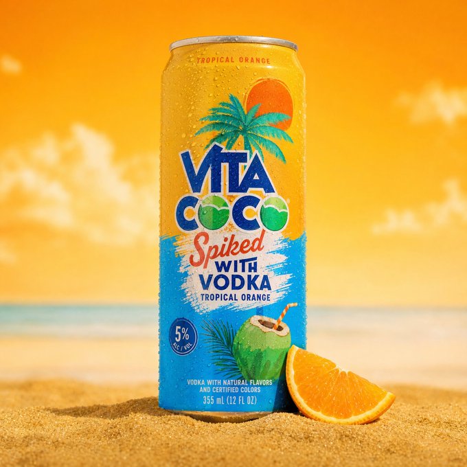
3. Social Ads Are Designed for a Phone
Social ad posters are not judged on a large monitor.
They are judged in a feed.
That means big subject, short headline, high contrast.
Prompt:
Create a high-impact social ad poster for the uploaded product.
Use dark dramatic lighting, a giant readable headline, and one clear benefit line.
Keep the product large and recognizable.
Design for mobile feed scrolling.
Small text is almost invisible on mobile.
Use less of it.
4. Campaign Posters Need Space for Real Details
If you are making a launch, livestream, holiday sale, or seasonal campaign, the image needs space for information.
Plan that space before the image is generated.
Create a vertical product campaign poster.
Use the product as the hero.
Reserve a clean top area for the campaign headline.
Reserve a bottom strip for date, offer, and CTA button.
Use a premium ecommerce campaign style.
This gives you room for:
- launch date
- livestream time
- member offer
- seasonal sale
- call to action
My Actual Order
I make product promotion posters in this order:
- clean product image
- launch poster
- benefit poster
- social ad version
- campaign version
That order keeps me honest.
If the product is not clear in the simple version, a dramatic campaign poster will not fix it.
The Bottom Line
Product promotion posters do not need to be the loudest image in the batch.
The best ones are usually controlled:
- the product is the hero
- the poster sells one benefit
- the headline works on mobile
- there is room for final campaign copy
AI is excellent for generating directions fast.
The poster worth keeping is the one that helps a shopper understand and click.
Frequently asked questions
Do I need a credit card to try GPT Image2 Studio?
No. Every new account starts with 30 credits on signup, then unlocks 30 more after the first successful image. Paid plans only kick in if you want more than the free ceiling.
Can I use the generated images commercially?
Yes. Every tier, including the free starter credits, comes with full commercial rights. Run ads, sell products, print on merchandise, publish on any platform. No watermark, no attribution required.
Which model should I route to for what?
Hero ads and text-heavy creative fit GPT Image 1.5 high. Product and macro texture work fit Nano Banana Pro. High-volume social iteration fits Nano Banana 2. Fast drafts and mood boards fit Z Image. The workbench can route one prompt across all of them.
How fast is a single generation?
Z Image returns in about 10 seconds. Nano Banana 2 often returns in 15 to 20 seconds. Nano Banana Pro and GPT Image 1.5 high usually take 30 to 45 seconds for standard quality, and up to about a minute for 4K high quality.
What's the difference between GPT Image 1.5 high and Nano Banana 2?
GPT Image 1.5 high is stronger for text inside images and premium ad creative. Nano Banana 2 is faster and cheaper. In production, compare both with the same prompt before choosing the final image.
Can I edit an existing image instead of generating from scratch?
Yes. Upload a reference image, then continue with image-to-image, masked edits, background removal, object cleanup, or compression inside the same workflow.
Stop guessing the model.
Run all three.
We route your prompt to GPT Image 1.5 high, Nano Banana 2, Z Image and more — same workbench, same prompt, side-by-side blind compare. 30 credits on signup, another 30 after your first successful image, and commercial rights at every tier.
30 + 30
Free credits
5+
SOTA models
30s
To first render


