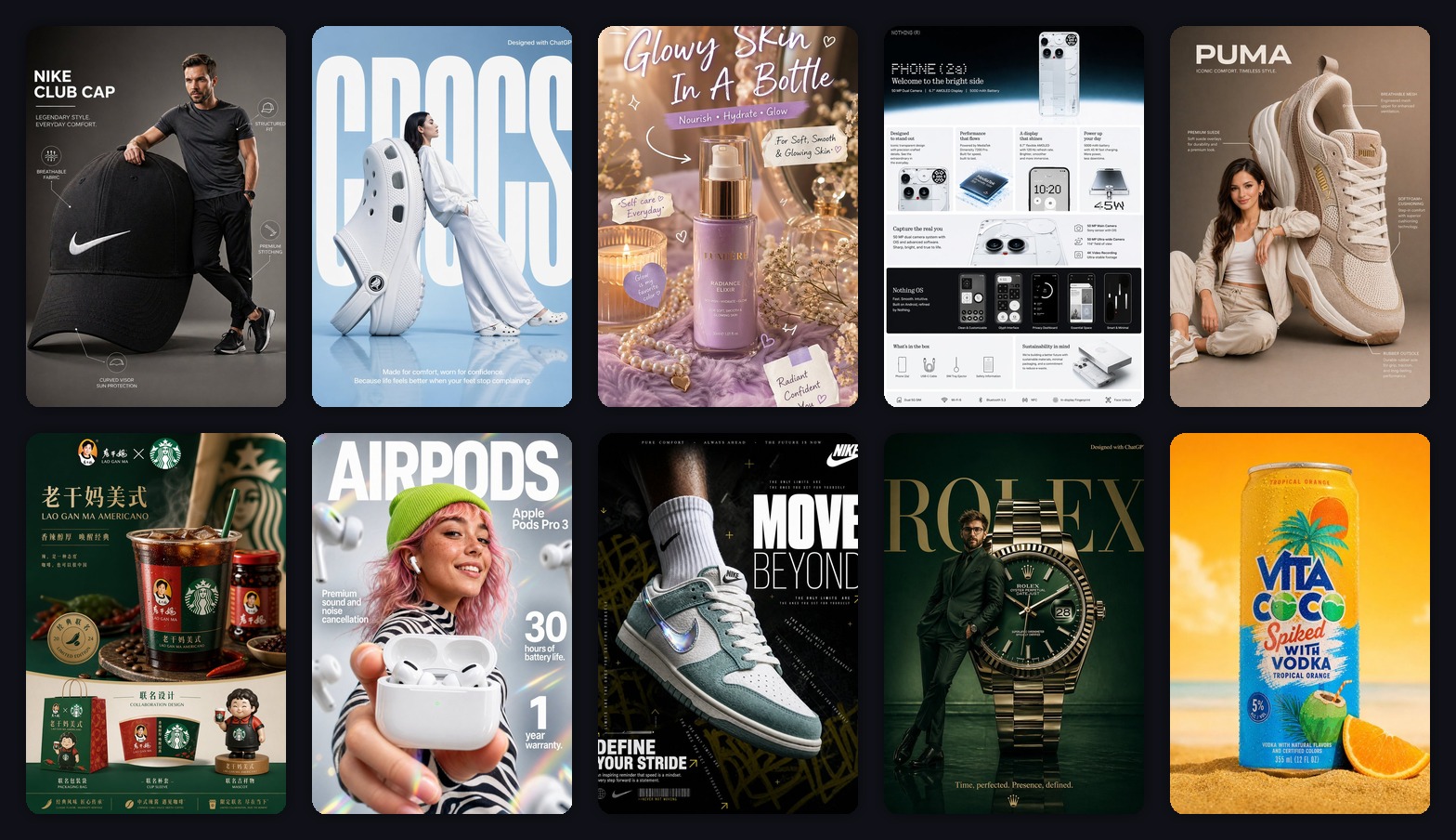
AIで商品ポスターを10枚作ったら、本当に使えたのは3タイプだけだった
スニーカー、イヤホン、スキンケア、ドリンク、EC詳細画像でAI商品ポスターを試した実践記録。どのポスターが使いやすいのかを整理します。

Emily Rodriguez
·2 min read

火曜の夜、10枚の商品画像をAIポスター生成ツールに入れて、1つだけルールを決めました。
あとからPhotoshopで救わない。
商品の形が変わったら失敗。
画像がきれいでも、見出しが読めなければ失敗。
ムードボードのように見えて、顧客に伝わらなければ失敗。
結果はかなり現実的でした。
本当に使いやすかったのは、3タイプだけです。
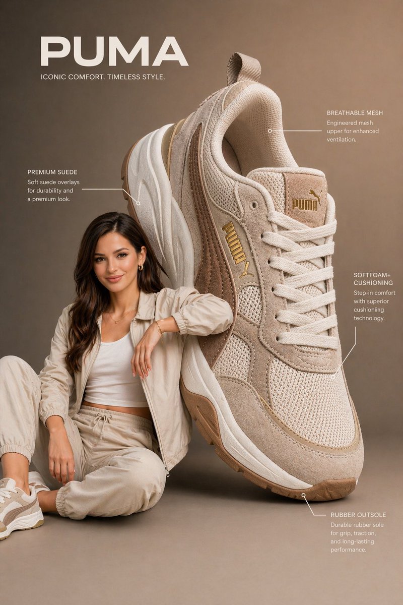
1. 商品が大きく分かるメインポスター
最初に使えるタイプは、商品がはっきり見えるポスターです。
このスニーカーポスターは、商品が大きく、形も読みやすいので使いやすい。
Create a vertical 3:4 product advertising poster.
Use the uploaded product as the main hero object.
Make the product large, sharp, and easy to recognize.
Add a premium studio background, one short headline, and 3 clean feature labels.
The poster should feel ready for ecommerce or social ads.
これは新商品、商品ページ、広告、SNS投稿に使いやすいです。
背景を派手にするより、商品が一瞬で分かることが大事です。
商品ポスターを生成する
商品画像をアップロードして、3:4の縦型商品広告ポスターを作ります。
2. 文字が少ない強いポスター
暗いスニーカーポスターはスクロールを止めやすいです。
コントラスト、動き、強い見出しがあります。
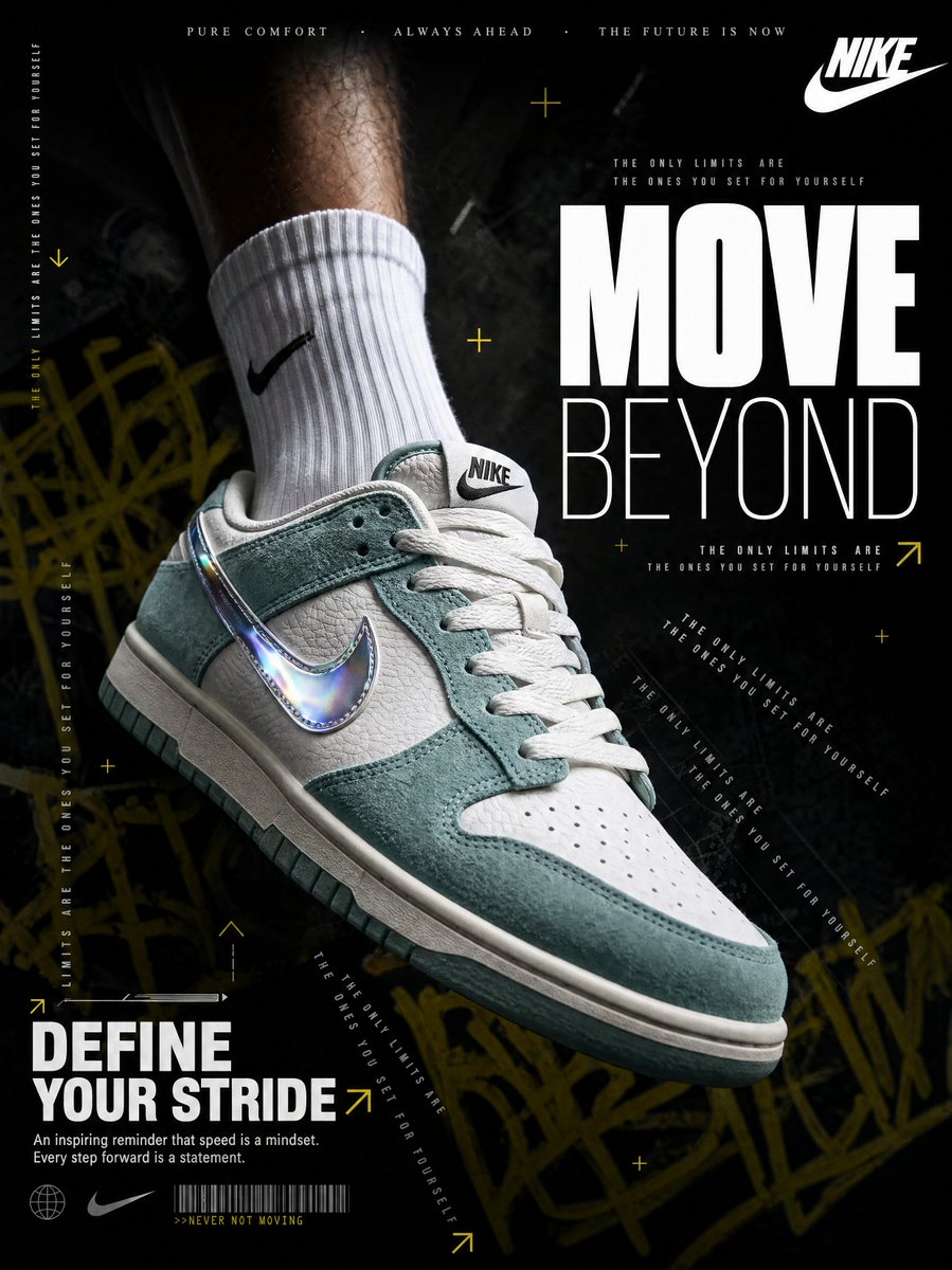
ただし、文字が増えるとすぐ崩れます。
Use one massive short headline only.
Add one small benefit line.
No paragraph text.
Make the product and headline readable at phone size.
ポスターは詳細ページではありません。
まず見てもらうための画像です。
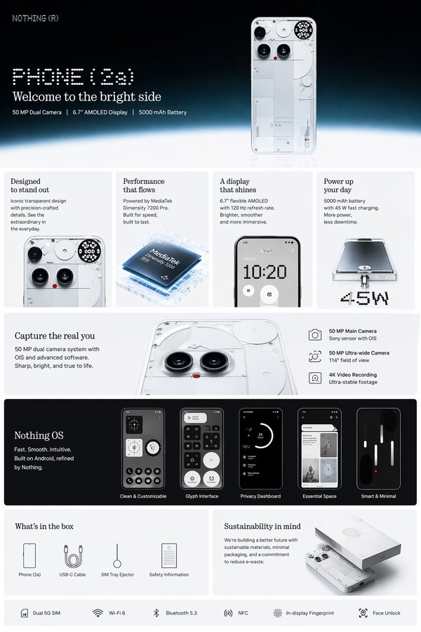
3. 説明できる詳細画像
スマホの詳細画像は、一番派手ではありません。
でもECではかなり使いやすいです。
Create a clean product-detail infographic.
Show the product at the top.
Add 4 feature cards with short labels.
Use close-up crops and a clean ecommerce page layout.
Keep the design readable on mobile.
購入前の疑問に答える画像は、広告ポスターより価値が出ることがあります。
The Bottom Line
AI商品ポスターは、最初の案出しにかなり使えます。
ただし、使える画像は一番派手なものとは限りません。
大事なのはこの3つです。
- 商品が分かる
- 文字が短い
- 売りが一つに絞られている
AIで方向を早く出して、本当に売る力がある画像だけを残すのが一番実用的です。
よくある質問
GPT Image2 Studio の無料試用にカードは必要ですか?
必要ありません。新規登録で30クレジット、最初の画像生成に成功するとさらに30クレジットを受け取れます。追加利用が必要な場合のみ有料プランを選べます。
生成した画像は商用利用できますか?
はい。無料のスタータークレジットを含め、各プランで商用利用が可能です。広告、商品ページ、印刷物、SNS投稿に使えます。ウォーターマークや必須クレジット表記はありません。
どのモデルを選べばいいですか?
文字入り広告やヒーロービジュアルは GPT Image 1.5 high、商品質感や細部は Nano Banana Pro、大量のSNS案は Nano Banana 2、素早いラフ制作は Z Image が向いています。同じプロンプトで並べて比較できます。
1枚の生成にはどのくらい時間がかかりますか?
Z Image は約10秒、Nano Banana 2 は15〜20秒、Nano Banana Pro と GPT Image 1.5 high は標準品質で30〜45秒ほどです。4K高品質では1分前後かかる場合があります。
GPT Image 1.5 high と Nano Banana 2 の違いは何ですか?
GPT Image 1.5 high は画像内テキストや広告品質に強く、Nano Banana 2 は高速でコストを抑えやすいモデルです。制作では同じプロンプトで比較して選ぶのが安全です。
既存画像の編集もできますか?
できます。参照画像をアップロードして、画像から画像への生成、部分編集、背景削除、不要物削除、圧縮まで同じ流れで進められます。
モデル選びで迷わない。
まとめて比較できます。
同じプロンプトを GPT Image 1.5 high、Nano Banana 2、Z Image など複数モデルで比較できます。ひとつのワークベンチで、納品に使える画像を素早く判断できます。登録で30クレジット、最初の成功生成後に追加30クレジット。商用利用権も各プランに含まれます。
30 + 30
無料クレジット
5+
主要モデル
30s
初回生成まで


