I Made 10 AI Product Posters. Only 3 Types Were Actually Useful.
A practical AI product poster test for sneakers, headphones, skincare, drinks, and ecommerce detail graphics: what looked good, what worked, and what I would generate again.

Emily Rodriguez
·5 min read

At 11:42 PM on a Tuesday, I dropped 10 product images into an AI poster generator and gave myself one rule:
No Photoshop rescue.
If the product shape changed, the poster failed.
If the image looked beautiful but the headline was unreadable, it failed.
If it looked like a moodboard instead of something a customer could understand, it failed.
The result was honest:
Only three types of posters were actually useful.
1. The Big, Clear Hero Poster
The first useful type is simple: make the product impossible to miss.
This sneaker poster worked because the product stayed large, sharp, and readable.
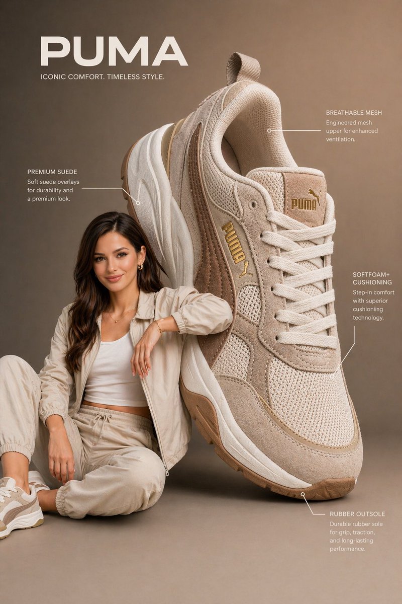
Use this:
Create a vertical 3:4 product advertising poster.
Use the uploaded product as the main hero object.
Make the product large, sharp, and easy to recognize.
Add a premium studio background, one short headline, and 3 clean feature labels.
The poster should feel ready for ecommerce or social ads.
This type works for product launches, store pages, landing pages, and paid social ads.
The point is not to make the background louder.
The point is to make the product unmistakable.
Generate a product poster
Upload a product image and start with a 3:4 vertical product ad poster.
2. The High-Impact Poster With Less Text
Dark sneaker posters are great at stopping the scroll.
They have contrast, motion, and attitude.
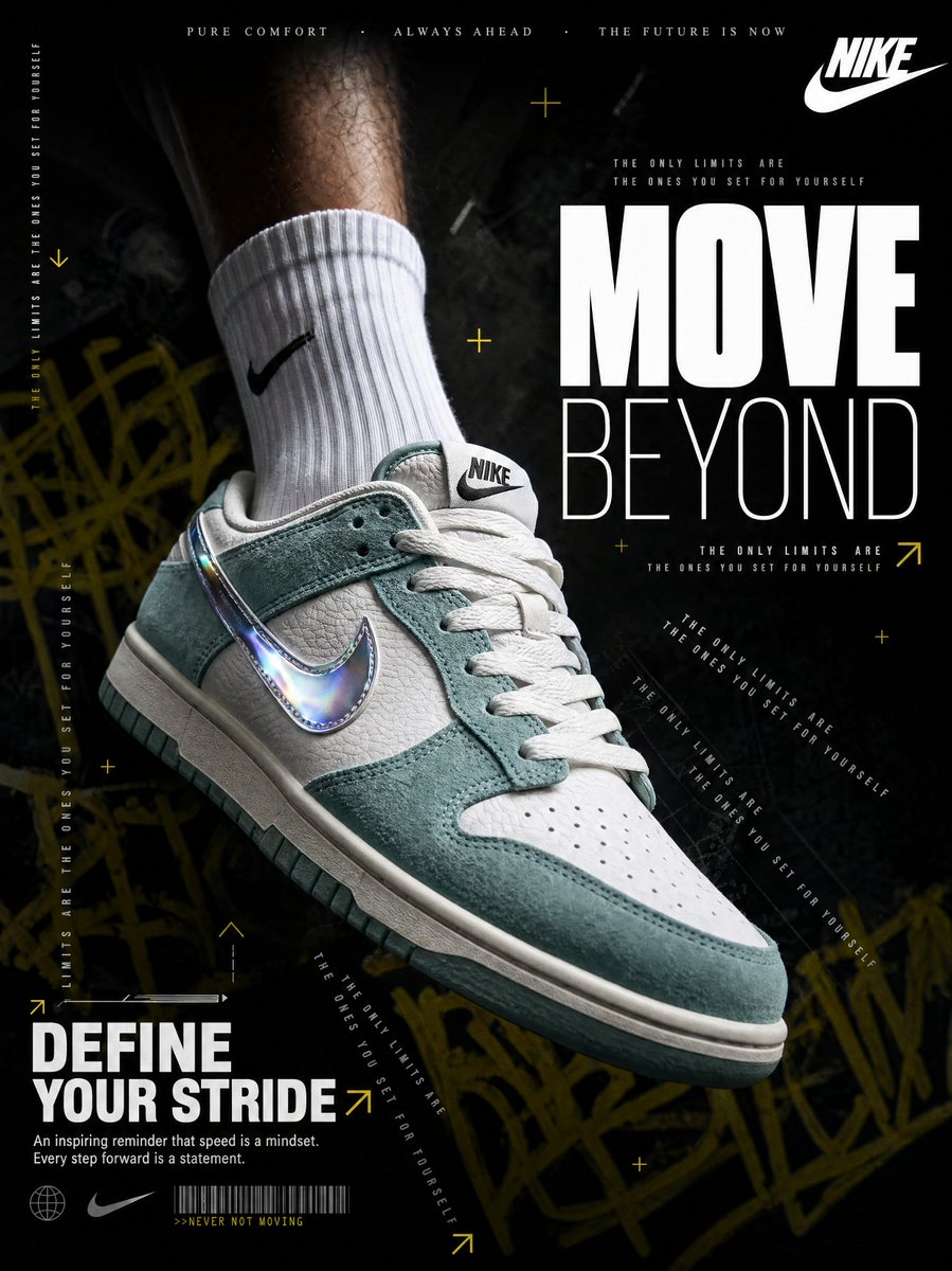
They also fail fast when the model adds too many words.
So I keep the text budget tight:
Use one massive short headline only.
Add one small benefit line.
No paragraph text.
Make the product and headline readable at phone size.
A poster is not a product detail page.
It earns attention. The landing page can explain the rest.
3. The Detail Graphic That Actually Explains
The phone detail graphic was not the coolest image in the batch.
It was one of the most useful.
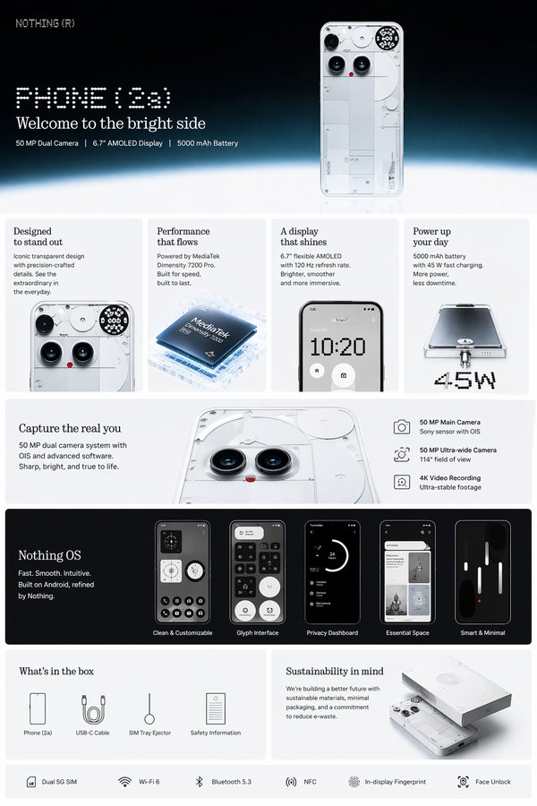
Use this:
Create a clean product-detail infographic.
Show the product at the top.
Add 4 feature cards with short labels.
Use close-up crops and a clean ecommerce page layout.
Keep the design readable on mobile.
If you sell online, this kind of image may be more valuable than the cinematic poster.
It helps the shopper understand why the product is worth buying.
Skincare and Drinks Need One Clear Feeling
Skincare posters are easy to make pretty.
Warm light, glass bottles, a vanity table, handwritten type: the model loves that.
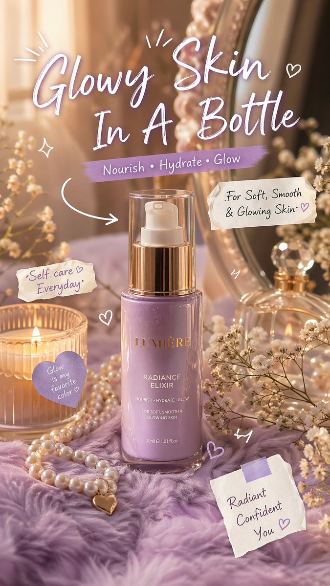
But for real ecommerce use, I prefer to let AI create the visual and add final claims or important text later.
Drinks are similar.
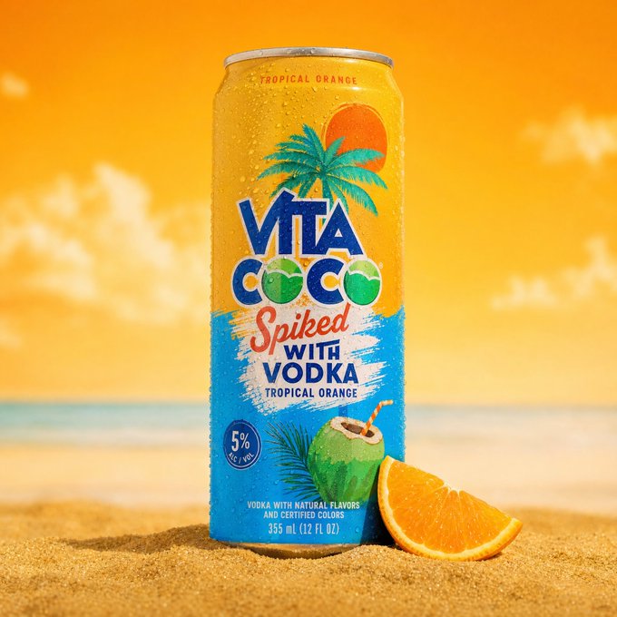
Pick one feeling:
- cold
- summer
- outdoor
- party
- light and refreshing
One poster should not say everything.
My 5-Question Check
Before I keep an AI product poster, I ask:
- Can I understand the product in two seconds?
- Does the product still look like the reference?
- Is the headline readable on a phone?
- Does the image have one clear selling point?
- Can it still work as a 4:5 or 9:16 crop?
If it only looks good on a large screen, it is not ready for social ads.
If the product changed, it is only a moodboard.
The Bottom Line
AI poster generators are already useful for first product ad drafts.
But the usable poster is usually not the flashiest one.
It is the one where:
- the product is clear
- the text is short
- the selling point is obvious
Use AI to explore directions fast, then keep the image that can actually sell.
Frequently asked questions
Do I need a credit card to try GPT Image2 Studio?
No. Every new account starts with 30 credits on signup, then unlocks 30 more after the first successful image. Paid plans only kick in if you want more than the free ceiling.
Can I use the generated images commercially?
Yes. Every tier, including the free starter credits, comes with full commercial rights. Run ads, sell products, print on merchandise, publish on any platform. No watermark, no attribution required.
Which model should I route to for what?
Hero ads and text-heavy creative fit GPT Image 1.5 high. Product and macro texture work fit Nano Banana Pro. High-volume social iteration fits Nano Banana 2. Fast drafts and mood boards fit Z Image. The workbench can route one prompt across all of them.
How fast is a single generation?
Z Image returns in about 10 seconds. Nano Banana 2 often returns in 15 to 20 seconds. Nano Banana Pro and GPT Image 1.5 high usually take 30 to 45 seconds for standard quality, and up to about a minute for 4K high quality.
What's the difference between GPT Image 1.5 high and Nano Banana 2?
GPT Image 1.5 high is stronger for text inside images and premium ad creative. Nano Banana 2 is faster and cheaper. In production, compare both with the same prompt before choosing the final image.
Can I edit an existing image instead of generating from scratch?
Yes. Upload a reference image, then continue with image-to-image, masked edits, background removal, object cleanup, or compression inside the same workflow.
Stop guessing the model.
Run all three.
We route your prompt to GPT Image 1.5 high, Nano Banana 2, Z Image and more — same workbench, same prompt, side-by-side blind compare. 30 credits on signup, another 30 after your first successful image, and commercial rights at every tier.
30 + 30
Free credits
5+
SOTA models
30s
To first render


