I Tried 12 AI Movie Posters. The Best Ones Used Less Text Than I Expected.
A practical AI movie poster generator test: what made the strongest posters work, why text-heavy prompts failed, and the prompt style I would reuse for cinematic posters, title typography, and credit blocks.

Sarah Thompson
·6 min read

I thought the hard part of an AI movie poster would be the image.
It was not.
The hard part was the text.
I ran a dozen movie-poster prompts through GPT Image2 Studio: sci-fi, anime thriller, prestige drama, horror, game adaptation, and a fake streaming documentary. The posters that looked best at thumbnail size were not the ones with the most clever prompts. They were the ones with the strictest typography rules.
The weak posters all had the same smell: too many names, too many credits, too many fake review quotes, and a title that looked dramatic until you actually tried to read it.
The best posters did less.
If you want an AI movie poster generator to produce something usable, you need to write the prompt like an art director, not a fan describing a film.
Open the movie-poster prompt
This opens GPT Image2 Studio with a cinematic poster prompt already loaded. Start there, then swap the title, genre, and visual hook.
The prompt that failed first
My first prompt sounded impressive:
Create an epic movie poster for a futuristic sci-fi film with dramatic lighting, cinematic composition, cast names, reviews, a tagline, a title, a credit block, festival laurels, and a mysterious atmosphere.It produced a poster-shaped image.
It did not produce a good poster.
The model tried to satisfy every request at once. The title competed with the cast names. The credits became texture. The review quotes looked like broken subtitles. The visual idea was buried under fake typography.
That is the first rule I learned:
Ask for fewer movie-poster conventions in the first pass.
The useful prompt was smaller
The version I would reuse is much tighter:
Create a vertical 2:3 cinematic movie poster for an original film concept.

Film:
Title: [TITLE]
Genre: [sci-fi / thriller / romance / horror / adventure]
Core image: [one visual hook]

Composition:
Use one strong central subject, a clear background environment, and a simple top-to-bottom hierarchy. Leave space for the title and credit block.

Typography:
Use only one title, one short tagline, and a small credit block. No critic quotes. No cast list unless requested. Title must be readable.

Lighting:
[cold rain / warm sunset / neon city / candlelit horror / dusty desert light]

Style:
Premium theatrical key art, cinematic, high contrast, poster-ready, no clutter.
The biggest change is not the vocabulary. It is the restraint.
Rule 1: one visual hook beats six plot details
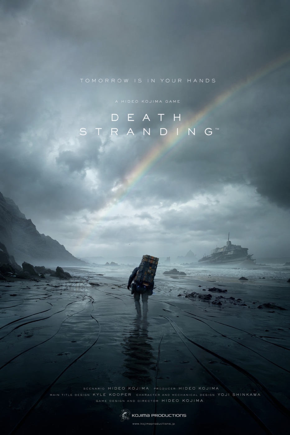
The strongest posters had one image you could remember:
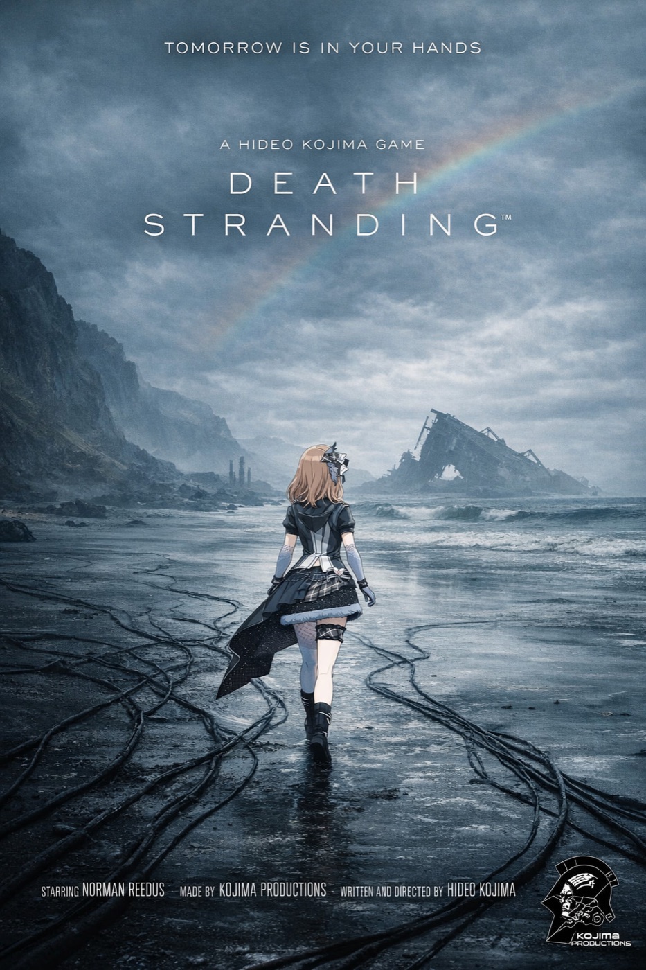
- A lone figure crossing a wet black beach.
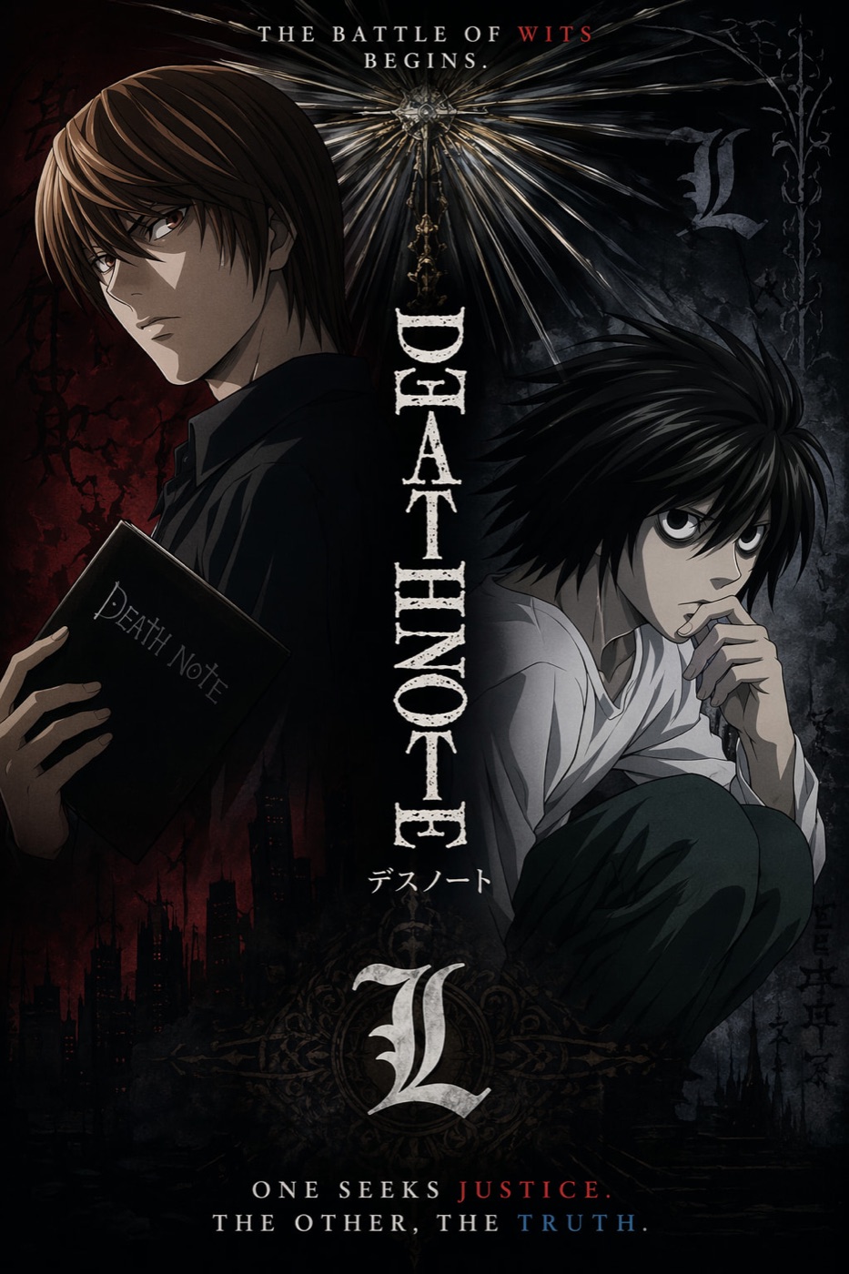
- Two anime characters divided by a moral conflict.
- A streamer-style vertical frame that looked like a fake documentary.
- A huge landscape that made the character feel small.
The weak posters tried to show the whole plot.
Movie posters do not summarize a film. They sell a question.
For example:
Core image:
A lone courier walking across a flooded black coastline under a broken rainbow, carrying an impossible metal case, tiny against the storm.
That gives the model something to compose.
"Epic sci-fi adventure about isolation, memory, and survival" gives it a cloud of vibes.
Rule 2: title first, credits last
When the title fails, the poster fails.
That sounds obvious, but AI models often treat text as decoration unless you force hierarchy. My best results came from explicitly ranking the text:
- Title
- Tagline
- Credit block
- Everything else removed
The prompt line I now use:
The title is the primary readable text. The tagline is secondary. The credit block is small and decorative. Keep critic quotes, awards, random dates, and extra names out of the poster.That one sentence reduced most of the junk text.
Rule 3: pick a genre grammar
A horror poster, anime thriller, prestige drama, and game adaptation do not use the same design language.
The model gets better when you name the grammar:
| Genre | Prompt language that helps |
|---|---|
| Sci-fi | vast scale, hard rim light, atmospheric haze, small human silhouette |
| Horror | negative space, single light source, restrained palette, hidden threat |
| Anime thriller | illustrated key art, split character composition, sharp title mark |
| Prestige drama | quiet portrait, low contrast, natural light, minimal type |
| Action game adaptation | bold perspective, HUD-like detail, kinetic composition |
The anime-style poster worked because it had a clean character conflict, not because it had more effects.
Rule 4: do not overbuild the credit block
AI can imitate a credit block.
It cannot always make every tiny name meaningful.
For concept posters, I use a credit block as visual texture, then keep the important readable text above it. If the final poster needs real production names, I would add those in a design tool after generation.
Prompt it like this:
Add a small theatrical credit block at the bottom as design texture. It should feel like a real film poster, but the title and tagline must remain the only important readable text.That keeps expectations realistic.
Rule 5: generate by ratio, not by crop
A 2:3 poster is not a cropped 16:9 image.
The composition changes. The subject placement changes. The amount of sky, floor, title space, and credits changes.
My ratio defaults:
| Use case | Ratio |
|---|---|
| Theatrical poster | 2:3 |
| Social feed poster | 4:5 |
| Story or Reel cover | 9:16 |
| Landing-page hero | 16:9 |
| Thumbnail test | 1:1 |
In real production, a movie poster generator should not stop at one output. You want a small set for different channels.
The Bottom Line
- The best AI movie posters use fewer text elements than you expect.
- Start with one visual hook, not a plot summary.
- Give the title priority before the credit block.
- Name the genre grammar so the model knows the design language.
- Use 2:3 for the poster itself, then regenerate for 4:5, 9:16, or 16:9.
Here is the shortest prompt I would use:
Create a vertical 2:3 cinematic movie poster for an original [genre] film titled "[TITLE]". Use one strong central visual hook, dramatic lighting, a readable title, one short tagline, and a small credit block at the bottom. No critic quotes, no extra cast list, no clutter.That gives the model enough structure to make a poster, and enough restraint to keep it readable.
Frequently asked questions
Do I need a credit card to try GPT Image2 Studio?
No. Every new account starts with 30 credits on signup, then unlocks 30 more after the first successful image. Paid plans only kick in if you want more than the free ceiling.
Can I use the generated images commercially?
Yes. Every tier, including the free starter credits, comes with full commercial rights. Run ads, sell products, print on merchandise, publish on any platform. No watermark, no attribution required.
Which model should I route to for what?
Hero ads and text-heavy creative fit GPT Image 1.5 high. Product and macro texture work fit Nano Banana Pro. High-volume social iteration fits Nano Banana 2. Fast drafts and mood boards fit Z Image. The workbench can route one prompt across all of them.
How fast is a single generation?
Z Image returns in about 10 seconds. Nano Banana 2 often returns in 15 to 20 seconds. Nano Banana Pro and GPT Image 1.5 high usually take 30 to 45 seconds for standard quality, and up to about a minute for 4K high quality.
What's the difference between GPT Image 1.5 high and Nano Banana 2?
GPT Image 1.5 high is stronger for text inside images and premium ad creative. Nano Banana 2 is faster and cheaper. In production, compare both with the same prompt before choosing the final image.
Can I edit an existing image instead of generating from scratch?
Yes. Upload a reference image, then continue with image-to-image, masked edits, background removal, object cleanup, or compression inside the same workflow.
Stop guessing the model.
Run all three.
We route your prompt to GPT Image 1.5 high, Nano Banana 2, Z Image and more — same workbench, same prompt, side-by-side blind compare. 30 credits on signup, another 30 after your first successful image, and commercial rights at every tier.
30 + 30
Free credits
5+
SOTA models
30s
To first render


