我用 AI 做了 12 张电影海报设计,最好看的反而文字更少
一次真实的电影海报设计和 AI海报生成器测试:什么样的 AI 电影海报更容易成功,为什么文字很多的提示词会失败,以及我会复用的标题字体和 credit block 提示词写法。

Sarah Thompson
·2 min read

我原本以为,做一张 AI 电影海报最难的是画面。
结果不是。
最难的是文字。
我在 GPT Image2 Studio 里跑了 12 组电影海报提示词:科幻、动画惊悚、文艺剧情、恐怖、游戏改编,还有一个假的流媒体纪录片。缩略图里最好看的,并不是提示词最花的那几张,而是文字规则最严格的那几张。
失败海报有同一种味道:人名太多,credit 太多,假影评太多,标题看起来很戏剧,真正读的时候却读不清。
最好的海报反而做得更少。
快速答案:AI 做电影海报设计时,最重要的不是把剧情讲完整,而是一个强视觉钩子、一个清晰片名、一句短 tagline 和一个不抢戏的 credit block。
如果你希望 AI 电影海报生成器产出能用的东西,提示词要像艺术指导写 brief,而不是像影迷在描述剧情。
打开电影海报提示词
GPT Image2 Studio 会预载一条电影海报提示词,你只需要替换片名、类型和主视觉钩子。
第一个失败提示词
我最开始写得很“完整”:
Create an epic movie poster for a futuristic sci-fi film with dramatic lighting, cinematic composition, cast names, reviews, a tagline, a title, a credit block, festival laurels, and a mysterious atmosphere.它确实生成了一张“像海报的图”。
但不是一张好海报。
模型试图同时满足所有要求:标题和演员名单抢层级,片尾 credit 变成纹理,影评像坏掉的字幕,真正的视觉想法被假字体埋掉。
我学到的第一条规则是:
不要让一条提示词塞进所有电影海报惯例。
有用的提示词更小
我会复用的是这个结构:
Create a vertical 2:3 cinematic movie poster for an original film concept.

Film:
Title: [TITLE]
Genre: [sci-fi / thriller / romance / horror / adventure]
Core image: [one visual hook]

Composition:
Use one strong central subject, a clear background environment, and a simple top-to-bottom hierarchy. Leave space for the title and credit block.

Typography:
Use only one title, one short tagline, and a small credit block. No critic quotes. No cast list unless requested. Title must be readable.

Lighting:
[cold rain / warm sunset / neon city / candlelit horror / dusty desert light]

Style:
Premium theatrical key art, cinematic, high contrast, poster-ready, no clutter.
最大的变化不是词汇,而是克制。
规则 1:一个视觉钩子,比六个剧情细节更有效
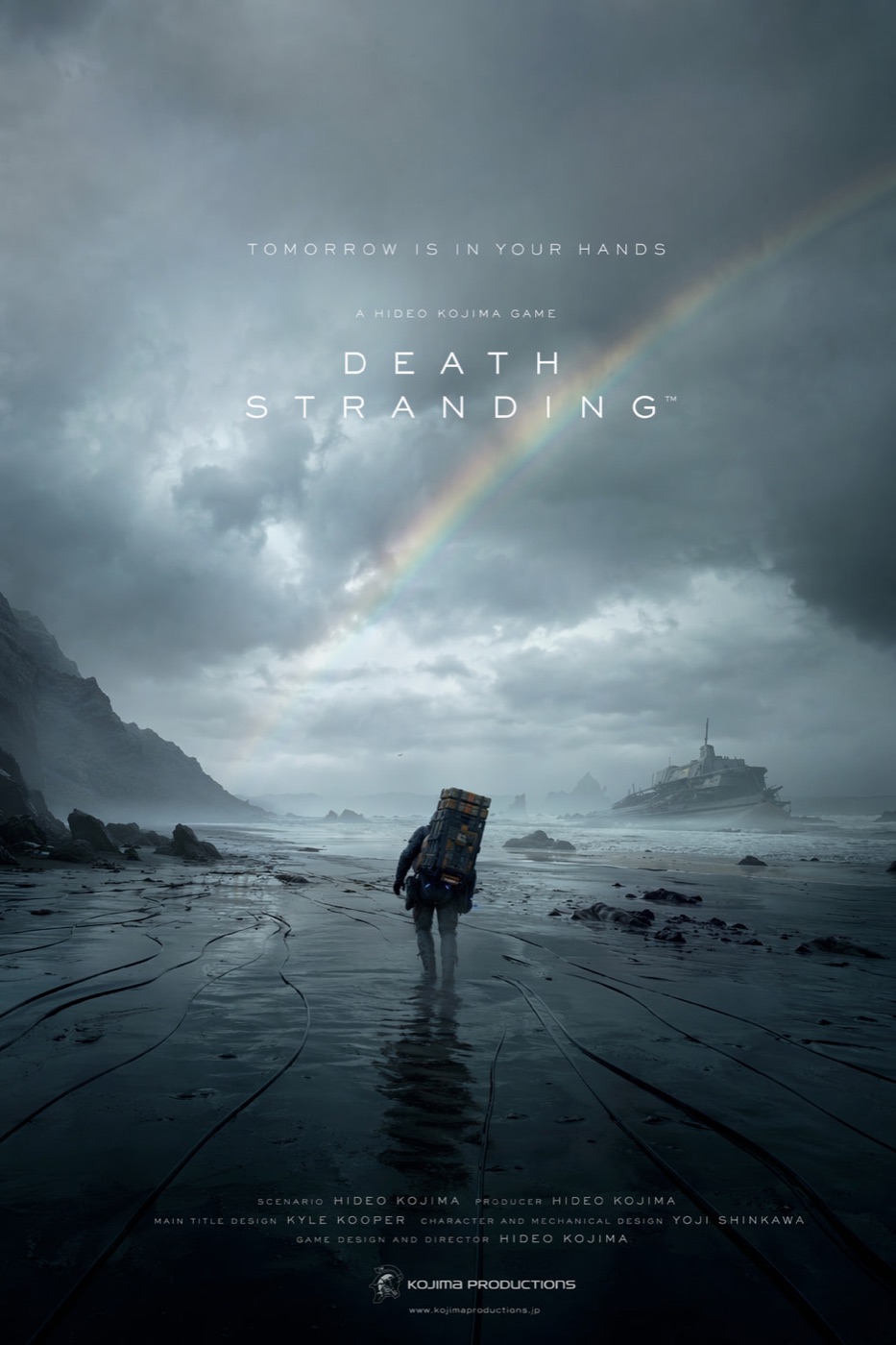
最强的海报都有一个你能记住的画面:
- 一个孤独人物穿过湿黑海滩。
- 两个动画角色被道德冲突分开。
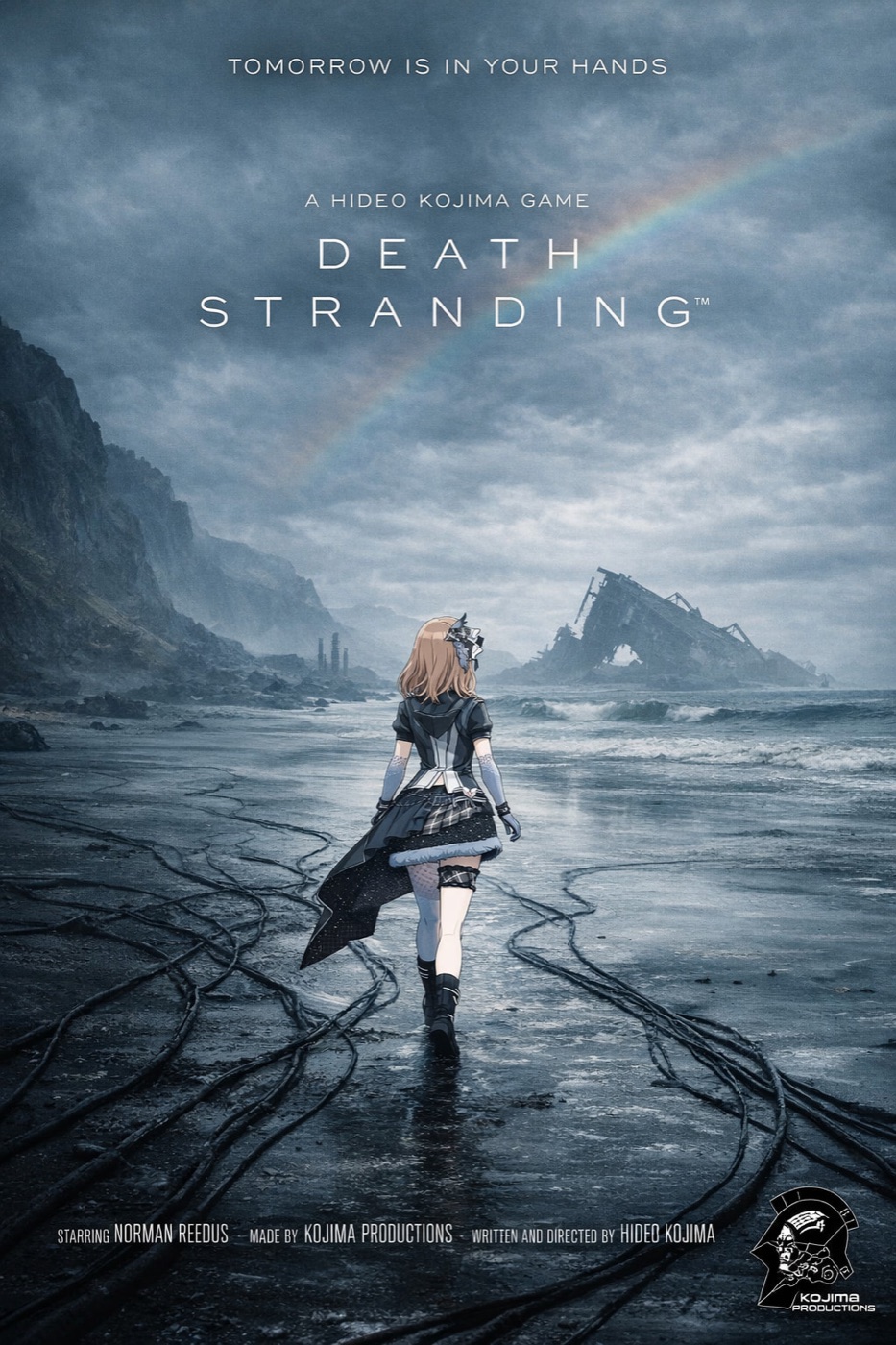
- 一个像流媒体纪录片封面的竖版画面。
- 一个巨大环境,让人物显得很小。
弱海报都试图把整部电影讲完。
电影海报不是剧情摘要。它卖的是一个问题。
比如:
Core image:
A lone courier walking across a flooded black coastline under a broken rainbow, carrying an impossible metal case, tiny against the storm.
这句话给了模型一个可以构图的画面。
“关于孤独、记忆和生存的史诗科幻冒险”只给了模型一团气氛。
规则 2:标题第一,credit 最后
标题失败,海报就失败。
这听起来很明显,但 AI 模型经常把文字当装饰。我的最佳结果来自于明确排序:
- 标题
- 短 tagline
- 底部 credit block
- 其它全部删除
我现在会加这一句:
The title is the primary readable text. The tagline is secondary. The credit block is small and decorative. Keep critic quotes, awards, random dates, and extra names out of the poster.这句话能减少大部分垃圾文字。
规则 3:给电影类型一个设计语法
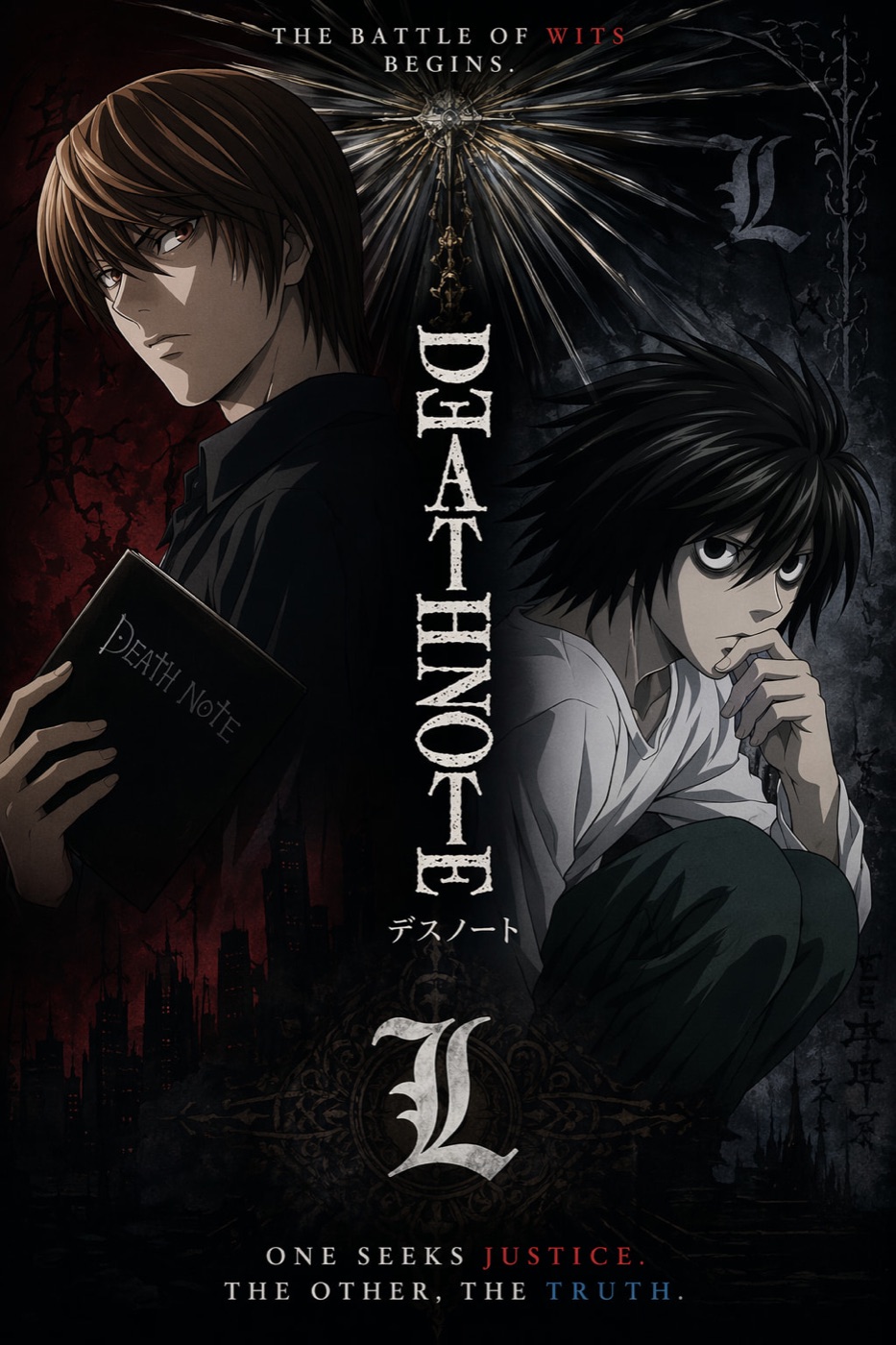
恐怖片、动画惊悚、文艺剧情和游戏改编,不应该用同一套设计语言。
你把类型语法说清楚,模型会稳定很多:
| 类型 | 有帮助的提示词语言 |
|---|---|
| 科幻 | 大尺度、硬边逆光、雾气、小人物剪影 |
| 恐怖 | 留白、单一光源、克制色盘、隐藏威胁 |
| 动画惊悚 | 插画 key art、双角色分裂构图、锐利标题标识 |
| 文艺剧情 | 安静肖像、低对比、自然光、少量文字 |
| 动作游戏改编 | 强透视、HUD 细节、动态构图 |
这张动画海报成立,不是因为特效更多,而是因为角色冲突更清楚。
规则 4:不要过度设计 credit block
AI 可以模仿电影海报底部的 credit block。
但它不一定能让每个小名字都有意义。
概念海报里,我会把 credit block 当视觉纹理使用,把真正重要的可读文字留给标题和 tagline。最终如果需要真实制作名单,我会在设计工具里后加。
提示词可以这样写:
Add a small theatrical credit block at the bottom as design texture. It should feel like a real film poster, but the title and tagline must remain the only important readable text.这能让预期更现实。
规则 5:按比例生成,不要靠裁切拯救
2:3 电影海报不是 16:9 图硬裁出来的。
比例一变,主体位置、天空、地面、标题空间、credit 区域都会变。
我会这样选比例:
| 用途 | 比例 |
|---|---|
| 院线电影海报 | 2:3 |
| 社媒 feed 海报 | 4:5 |
| Story 或 Reel 封面 | 9:16 |
| 落地页 hero | 16:9 |
| 缩略图测试 | 1:1 |
“电影海报生成器”听起来像只要一个输出。真实生产里,你要的是一小组适配不同渠道的图。
The Bottom Line
- 最好的 AI 电影海报,文字元素比你想象得更少。
- 从一个视觉钩子开始,不要从剧情简介开始。
- 标题优先级必须高于 credit block。
- 写清楚类型语法,让模型知道设计语言。
- 真正的电影海报用 2:3,然后再为 4:5、9:16、16:9 重新生成。
我会用的最短提示词是:
Create a vertical 2:3 cinematic movie poster for an original [genre] film titled "[TITLE]". Use one strong central visual hook, dramatic lighting, a readable title, one short tagline, and a small credit block at the bottom. No critic quotes, no extra cast list, no clutter.这给了模型足够的结构,也给了它足够的限制。
常见问题
试用 GPT Image2 Studio 需要银行卡吗?
不需要。新账号注册即可获得 30 点数,首次成功生成后还能再解锁 30 点数。只有需要更多用量时才需要选择付费方案。
生成图片可以商用吗?
可以。包括免费启动点数在内,每个档位都包含商用授权。可用于广告、商品页、印刷物和社媒内容,无水印,也不强制署名。
不同模型适合什么任务?
广告主视觉和含文字创意优先用 GPT Image 1.5 high;商品质感和微距细节适合 Nano Banana Pro;大量社媒迭代适合 Nano Banana 2;快速草图和情绪板可以用 Z Image。工作台可以让同一个提示词同时跑多个模型。
单张生成通常需要多久?
Z Image 通常约 10 秒返回;Nano Banana 2 约 15 到 20 秒;Nano Banana Pro 和 GPT Image 1.5 high 标准质量通常 30 到 45 秒,4K 高质量可能接近 1 分钟。
GPT Image 1.5 high 和 Nano Banana 2 有什么差别?
GPT Image 1.5 high 更适合图中文字和高要求广告创意;Nano Banana 2 更快,成本也更低。实际生产中建议同一提示词并排比较,再选最稳的结果。
可以编辑已有图片吗?
可以。上传参考图后,可以做图生图、局部重绘、去背景、擦除和压缩,让同一张图继续完成后续交付。


