映画ポスター 作成をAIで12回試した。良かったものほど文字が少なかった
映画ポスター AIを使った実践テスト。映画ポスター作成で強いビジュアルに必要な要素、文字が多いプロンプトが失敗する理由、タイトルとクレジットブロックの書き方をまとめます。

Sarah Thompson
·2 min read

AIで映画ポスターを作るとき、一番難しいのは絵だと思っていました。
違いました。
一番難しいのは文字です。
GPT Image2 Studio で12本分の映画ポスタープロンプトを試しました。SF、アニメスリラー、文芸ドラマ、ホラー、ゲーム原作風、配信ドキュメンタリー風。サムネイルで一番強く見えたのは、凝ったプロンプトではありません。文字ルールが一番厳しいプロンプトでした。
弱い映画ポスターには共通点があります。名前が多い。クレジットが多い。偽レビューが多い。タイトルはドラマチックに見えるのに、実際には読みにくい。
良いポスターほど、やることが少ない。
結論から言うと、映画ポスター 作成をAIで行うなら、プロンプトは映画ファンの感想ではなく、アートディレクターの指示書として書くべきです。
映画ポスター用プロンプトを開く
GPT Image2 Studio に映画ポスター AI 用のプロンプトを読み込んで開きます。タイトル、ジャンル、中心ビジュアルだけ差し替えてください。
最初に失敗したプロンプト
最初のプロンプトは、いかにも良さそうでした。
Create an epic movie poster for a futuristic sci-fi film with dramatic lighting, cinematic composition, cast names, reviews, a tagline, a title, a credit block, festival laurels, and a mysterious atmosphere.ポスターの形をした画像は出ました。
でも良いポスターではありません。
モデルはすべてを同時に満たそうとしました。タイトルはキャスト名と競合し、クレジットは模様になり、レビューは壊れた字幕のようになり、中心のビジュアルが埋もれました。
最初に学んだルールはこれです。
映画ポスターの慣習を、1回のプロンプトに全部入れない。
使えるプロンプトは小さい
私が再利用するなら、この構造です。
Create a vertical 2:3 cinematic movie poster for an original film concept.

Film:
Title: [TITLE]
Genre: [sci-fi / thriller / romance / horror / adventure]
Core image: [one visual hook]

Composition:
Use one strong central subject, a clear background environment, and a simple top-to-bottom hierarchy. Leave space for the title and credit block.

Typography:
Use only one title, one short tagline, and a small credit block. No critic quotes. No cast list unless requested. Title must be readable.

Lighting:
[cold rain / warm sunset / neon city / candlelit horror / dusty desert light]

Style:
Premium theatrical key art, cinematic, high contrast, poster-ready, no clutter.
重要なのは語彙ではなく、制限です。
ルール1:6つの設定より、1つのビジュアルフック
強い映画ポスターには、覚えられる絵があります。
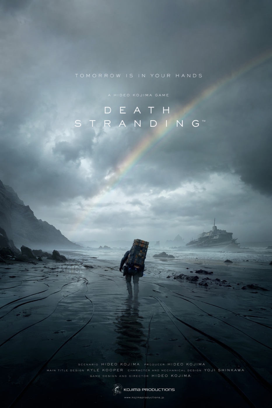
- 濡れた黒い海岸を歩く孤独な人物。
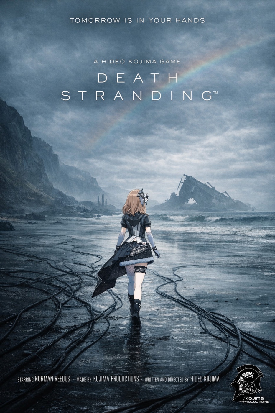
- 道徳的な対立で分かれた2人のアニメキャラクター。
- 配信ドキュメンタリーのような縦長フレーム。
- 人物を小さく見せる巨大な風景。
弱いポスターは、映画の全内容を説明しようとします。
映画ポスターはあらすじではありません。疑問を売るものです。
Core image:
A lone courier walking across a flooded black coastline under a broken rainbow, carrying an impossible metal case, tiny against the storm.
これは構図にできます。
「孤独、記憶、生存を描く壮大なSF冒険」は、雰囲気だけです。
ルール2:タイトルを最優先にする
タイトルが読めなければ、ポスターは失敗です。
AIモデルは文字を装飾として扱うことがあります。だから私は、文字の優先順位を明示します。
- タイトル
- 短いタグライン
- 小さなクレジットブロック
- それ以外は削除
使う文はこれです。
The title is the primary readable text. The tagline is secondary. The credit block is small and decorative. Keep critic quotes, awards, random dates, and extra names out of the poster.この一文で、不要な文字がかなり減ります。
ルール3:ジャンルの文法を指定する
ホラー、アニメスリラー、文芸ドラマ、ゲーム原作風では、デザイン言語が違います。
| ジャンル | 効くプロンプト表現 |
|---|---|
| SF | 大きなスケール、硬いリムライト、霞、小さな人影 |
| ホラー | 余白、単一光源、抑えた色、隠れた脅威 |
| アニメスリラー | キーアート、分割されたキャラクター構図、鋭いタイトル |
| 文芸ドラマ | 静かなポートレート、低コントラスト、自然光 |
| アクションゲーム原作 | 強い遠近感、HUD風ディテール、動きのある構図 |
アニメ風ポスターが良かったのは、効果が多いからではありません。キャラクターの対立が明確だったからです。
ルール4:クレジットブロックを作り込みすぎない
AIはクレジットブロックを真似できます。
でも細かい名前を正確な情報として扱うのは苦手です。
コンセプトポスターでは、クレジットブロックは視覚的な質感として使い、本当に読ませたい文字はタイトルとタグラインに絞ります。実名が必要なら、最後にデザインツールで足します。
Add a small theatrical credit block at the bottom as design texture. It should feel like a real film poster, but the title and tagline must remain the only important readable text.ルール5:クロップではなく比率で生成する
2:3の映画ポスターは、16:9を切り抜いたものではありません。
比率が変わると、人物位置、空、地面、タイトル余白、クレジット領域が変わります。
| 用途 | 比率 |
|---|---|
| 劇場ポスター | 2:3 |
| SNSフィード | 4:5 |
| Story / Reel カバー | 9:16 |
| ランディングページ | 16:9 |
| サムネイルテスト | 1:1 |
The Bottom Line
- 良い映画ポスター AI は、思ったより文字が少ないです。
- あらすじではなく、1つのビジュアルフックから始めます。
- タイトルを最重要の可読テキストにします。
- ジャンルごとのデザイン文法を指定します。
- 2:3で作り、4:5、9:16、16:9は別に生成します。
最短プロンプトはこれです。
Create a vertical 2:3 cinematic movie poster for an original [genre] film titled "[TITLE]". Use one strong central visual hook, dramatic lighting, a readable title, one short tagline, and a small credit block at the bottom. No critic quotes, no extra cast list, no clutter.これで、映画ポスター作成に必要な構造と制限が入ります。
よくある質問
GPT Image2 Studio の無料試用にカードは必要ですか?
必要ありません。新規登録で30クレジット、最初の画像生成に成功するとさらに30クレジットを受け取れます。追加利用が必要な場合のみ有料プランを選べます。
生成した画像は商用利用できますか?
はい。無料のスタータークレジットを含め、各プランで商用利用が可能です。広告、商品ページ、印刷物、SNS投稿に使えます。ウォーターマークや必須クレジット表記はありません。
どのモデルを選べばいいですか?
文字入り広告やヒーロービジュアルは GPT Image 1.5 high、商品質感や細部は Nano Banana Pro、大量のSNS案は Nano Banana 2、素早いラフ制作は Z Image が向いています。同じプロンプトで並べて比較できます。
1枚の生成にはどのくらい時間がかかりますか?
Z Image は約10秒、Nano Banana 2 は15〜20秒、Nano Banana Pro と GPT Image 1.5 high は標準品質で30〜45秒ほどです。4K高品質では1分前後かかる場合があります。
GPT Image 1.5 high と Nano Banana 2 の違いは何ですか?
GPT Image 1.5 high は画像内テキストや広告品質に強く、Nano Banana 2 は高速でコストを抑えやすいモデルです。制作では同じプロンプトで比較して選ぶのが安全です。
既存画像の編集もできますか?
できます。参照画像をアップロードして、画像から画像への生成、部分編集、背景削除、不要物削除、圧縮まで同じ流れで進められます。
モデル選びで迷わない。
まとめて比較できます。
同じプロンプトを GPT Image 1.5 high、Nano Banana 2、Z Image など複数モデルで比較できます。ひとつのワークベンチで、納品に使える画像を素早く判断できます。登録で30クレジット、最初の成功生成後に追加30クレジット。商用利用権も各プランに含まれます。
30 + 30
無料クレジット
5+
主要モデル
30s
初回生成まで


